Dual range - such a usual and well-known element, isn't it? But there is still no native implementation in HTML. So sad. But that means it's time for new experiments.
Mostly for my projects I used noUiSlider to implement single and dual-range sliders.
It's flexible and powerful, yes. However, sometimes it might be over-kill for tiny UI solutions. That's why we'll try to create an own implementation. The desired view we'd want to achieve is:
- A single slider with two handlers;
- A couple of numeric inputs two-ways bond with the handlers position;
- A couple of tooltips above the handlers indicating the current value.
Initial styling
Now let's start styling. Initially the range input might look different according to the environment you're using.
That's not good. Your designer might be angry. Fortunately, we have a bunch of selectors to modify the view for the most of the browsers. Let's do with using SCSS have custom variables to re-style it faster. Probably, you can use pure CSS variable if you want.
$range-height: 2rem !default;
$range-border-radius: 0.25rem !default;
$range-track-size: 0.4rem !default;
$range-track-bg: #e9ecef !default;
$range-fill-bg: #0d6efd !default;
$range-disabled-track-bg: #dee2e6 !default;
$range-handle-size: 1rem !default;
$range-handle-border: 1px solid #dee2e6 !default;
$range-handle-border-radius: 50% !default;
$range-handle-bg: #fff !default;
$range-disabled-handle-bg: #e9ecef !default;
$range-handle-shadow: 0 1px 3px #dee2e6 !default;
$range-tooltip-bg: #0d6efd !default;
$range-tooltip-color: #fff !default;
$range-tooltip-padding: 0 0.5rem !default;
$range-tooltip-border-radius: 0.25rem !default;

@mixin range-track($properties) {
    // note: do not combine browsers selectors with comma - not working
    &::-webkit-slider-runnable-track {
        @each $property, $value in $properties {
            #{$property}: #{$value};
        }
    }

    &::-moz-range-track {
        @each $property, $value in $properties {
            #{$property}: #{$value};
        }
    }

    &::-ms-track {
        @each $property, $value in $properties {
            #{$property}: #{$value};
        }
    }
}

@mixin range-handle($properties) {
    &::-webkit-slider-thumb {
        @each $property, $value in $properties {
            #{$property}: #{$value};
        }
    }

    &::-moz-range-thumb {
        @each $property, $value in $properties {
            #{$property}: #{$value};
        }
    }

    &::-ms-thumb {
        @each $property, $value in $properties {
            #{$property}: #{$value};
        }
    }
}

@mixin range() {
    @include range-track((
        width: 100%,
        height: $range-track-size,
        border: 0 solid transparent,
        border-radius: $range-border-radius,
        background: $range-track-bg,
        cursor: pointer
    ));

    @include range-handle((
        width: $range-handle-size,
        height: $range-handle-size,
        border: $range-handle-border,
        border-radius: $range-handle-border-radius,
        background: $range-handle-bg,
        box-shadow: $range-handle-shadow,
        cursor: pointer
    ));

    display: block;
    width: 100%;
    height: $range-height;
    appearance: none;

    &:focus {
        @include range-track((background: $range-track-bg));
    }

    &:disabled {
        @include range-track((background: $range-disabled-track-bg));
        @include range-handle((background: $range-disabled-handle-bg));
        cursor: not-allowed;
    }

    &::-webkit-slider-thumb {
        -webkit-appearance: none;
        margin-top: ($range-track-size / 2) - ($range-handle-size / 2);
    }
}

.range {
    @include range();
}
You might notice there is a negative margin for the range handle only for webkit. Alternatively, it'll be placed wrong.
Now when it looks fine, let's return to the topic.
HTML
Here is our basic layout. We'll make it look as we want using CSS later.
<fieldset class="card card-body mb-4">
    <legend>My little double range</legend>
    <label class="visually-hidden" for="double-range-example-1-from">From</label>
    <label class="visually-hidden" for="double-range-example-1-to">To</label>
    <div class="double-range">
        <div class="double-range-sliders"><input type="range" class="double-range-slider is-field-from"
            id="double-range-example-1-from" min="10" max="100" step="1" value="10"
            data-component="double-range-from-slider">
            <input type="range" class="double-range-slider is-field-to"
                id="double-range-example-1-to" min="10" max="100" step="1" value="80"
                data-component="double-range-to-slider"></div>
        <label class="double-range-input-label">
            From
            <input type="number" class="double-range-input-field form-control"
                min="10" max="100" step="1" value="10"
                data-component="double-range-from-input"></label>
        <label class="double-range-input-label">
            To
            <input type="number" class="double-range-input-field form-control"
                min="10" max="100" step="1" value="80"
                data-component="double-range-to-input"></label>
    </div>
</fieldset>Nothing specific yet. Take a look at data-component attributes of elements. We'll use it to select and handle them using JS. Also, visually-hidden class is used to hide the element but keep it for screen-readers.
I hope you understand the min and max (and step, if exists) values should be the same for all four input elements, because they have the same range of possible values.
Basic styles
We made the first slider track transparent and placed absolute above another slider. Also, we'll make the container element be flex to place numeric inputs in line until there is enough of space available.
Our previously made range() mixin is applied to the range inputs of our component to make them fancy and normalized.
.double-range {
    position: relative;
    display: flex;
    flex-wrap: wrap;
    gap: 0 1rem;

    &-sliders {
        position: relative;
        flex: 100%;
    }

    &-slider {
        @include range();

        &.is-field-from {
            position: absolute;
            top: 0;
            right: 0;
            bottom: 0;
            left: 0;
            z-index: 1;
            background-color: transparent;

            &,
            &:focus {
                @include range-track((background-color: transparent));
            }
        }
    }

    &-input {
        &-label {
            flex: 1 6rem;
        }

        &-field {
            display: block;
            width: 100%;
        }
    }
}Now we need to implement some interaction.
JS
Let's create a new class to control our stuff. First of all, it finds child elements to work with them. Also, it adds event listeners to these elements to bind a slider to an appropriate input, and to not let "from" input values be larger than "to" element values.
export class DoubleRange {
    /**
     * Class constructor
     * @param {HTMLElement} element - inputs wrapper element
     * @returns this
     */
    constructor(element) {
        this.element = element;
        this.fromSlider = element.querySelector('[data-component~="double-range-from-slider"]');
        this.fromInput = element.querySelector('[data-component~="double-range-from-input"]');
        this.toSlider = element.querySelector('[data-component~="double-range-to-slider"]');
        this.toInput = element.querySelector('[data-component~="double-range-to-input"]');

        return this.init();
    }

    /**
     * Init class
     * @returns this
     */
    init() {
        return this.initEventListeners();
    }

    /**
     * Attach all required event listeners
     * @returns this
     */
    initEventListeners() {
        this.fromSlider.addEventListener('input', () => {
            const [from, to] = this.getValue(this.fromSlider, this.toSlider);

            if (from > to) {
                this.fromSlider.value = to;
                this.fromInput.value = to;
            } else {
                this.fromInput.value = from;
            }
        });

        this.fromInput.addEventListener('input', () => {
            const [from, to] = this.getValue(this.fromInput, this.toInput);

            if (from > to) {
                this.fromSlider.value = to;
                this.fromInput.value = to;
            } else {
                this.fromSlider.value = from;
            }
        });

        this.toSlider.addEventListener('input', () => {
            const [from, to] = this.getValue(this.fromSlider, this.toSlider);

            this.toInput.value = from <= to ? to : from;
            this.toSlider.value = from <= to ? to : from;
        });

        this.toInput.addEventListener('input', () => {
            const [from, to] = this.getValue(this.fromInput, this.toInput);

            if (from <= to) {
                this.toSlider.value = to;
                this.toInput.value = to;
            } else {
                this.toInput.value = from;
            }
        });

        return this;
    }

    /**
     * Get two input numeric values
     * @param {HTMLInputElement} fromInput - least value input
     * @param {HTMLInputElement} toInput - greatest value input
     * @returns [Number, Number]
     */
    getValue(fromInput, toInput) {
        return [Number(fromInput.value), Number(toInput.value)];
    }
}
And the using of this class:
import { DoubleRange } from './double-range.js';

for (let element of document.querySelectorAll('[data-component~="double-range"]')) {
    element.doubleRange = new DoubleRange(element);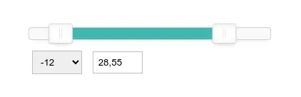
}Not bad at the moment. We see the inputs are bond, but we can't interact the "to" slider cause its placed lower the "from" one. Also, in-between space isn't filled correct. And we need to implement the tooltips somehow.
To do that, we'll calculate the difference proportion for both sliders position and set these values into CSS variables. Moreover, we'll keep the current input values into data-attribute of the element.
There is a new method, and it's fired on class construct and changing any of input value. The final JS class is:
export class DoubleRange {
    /**
     * Class constructor
     * @param {HTMLElement} element - inputs wrapper element
     * @returns this
     */
    constructor(element) {
        this.element = element;
        this.fromSlider = element.querySelector('[data-component~="double-range-from-slider"]');
        this.fromInput = element.querySelector('[data-component~="double-range-from-input"]');
        this.toSlider = element.querySelector('[data-component~="double-range-to-slider"]');
        this.toInput = element.querySelector('[data-component~="double-range-to-input"]');

        return this.init();
    }

    /**
     * Init class
     * @returns this
     */
    init() {
        return this.initEventListeners().setVariables();
    }

    /**
     * Attach all required event listeners
     * @returns this
     */
    initEventListeners() {
        this.fromSlider.addEventListener('input', () => {
            const [from, to] = this.getValue(this.fromSlider, this.toSlider);

            if (from > to) {
                this.fromSlider.value = to;
                this.fromInput.value = to;
            } else {
                this.fromInput.value = from;
            }

            this.setVariables();
        });

        this.fromInput.addEventListener('input', () => {
            const [from, to] = this.getValue(this.fromInput, this.toInput);

            if (from > to) {
                this.fromSlider.value = to;
                this.fromInput.value = to;
            } else {
                this.fromSlider.value = from;
            }

            this.setVariables();
        });

        this.toSlider.addEventListener('input', () => {
            const [from, to] = this.getValue(this.fromSlider, this.toSlider);

            this.toInput.value = from <= to ? to : from;
            this.toSlider.value = from <= to ? to : from;

            this.setVariables();
        });

        this.toInput.addEventListener('input', () => {
            const [from, to] = this.getValue(this.fromInput, this.toInput);

            if (from <= to) {
                this.toSlider.value = to;
                this.toInput.value = to;
            } else {
                this.toInput.value = from;
            }

            this.setVariables();
        });

        return this;
    }

    /**
     * Get two input numeric values
     * @param {HTMLInputElement} fromInput - least value input
     * @param {HTMLInputElement} toInput - greatest value input
     * @returns [Number, Number]
     */
    getValue(fromInput, toInput) {
        return [Number(fromInput.value), Number(toInput.value)];
    }

    /**
     * Set CSS variables and other attributes according to the current values
     * @returns this
     */
    setVariables() {
        const rangeDistance = this.fromInput.max - this.fromInput.min;
        const fromPosition = (this.fromInput.value - this.fromInput.min) / rangeDistance * 100;
        const toPosition = (this.toInput.value - this.toInput.min) / rangeDistance * 100;

        this.element.style.setProperty('--from-position', `${fromPosition}%`);
        this.element.style.setProperty('--to-position', `${toPosition}%`);
        this.element.setAttribute('data-from-value', this.fromInput.value);
        this.element.setAttribute('data-to-value', this.toInput.value);

        return this;
    }
}
CSS
Track filling
With dynamic CSS variables we finally can add color to the track. As the "from" slider track is transparent, we'll apply background gradient to another slider's track.
The default color starts from zero to the current "from" position in percents. Next is going the filled track color until the "to" position in percents. And then get back to the default color until the end of the track.
The first bottleneck we met is still no logical properties of the linear-gradient function. To fix that a new special variable is used to change the direction for RTL.
.double-range {
    --track-bg: #{$range-track-bg};
    --fill-bg: #{$range-fill-bg};
    --track-direction: right;
    --from-position: 0%;
    --to-position: 100%;

    @at-root [dir="rtl"] & {
        --track-direction: left;
    }

    &-slider {
        &.is-field-to:not(:disabled) {
            @include range-track((background: linear-gradient(
                to var(--track-direction, right),
                var(--track-bg) 0%, var(--track-bg) var(--from-position),
                var(--fill-bg) var(--from-position),
                var(--fill-bg) var(--to-position),
                var(--track-bg) var(--to-position),
                var(--track-bg) 100%
            )));
        }
    }
}Change the input values or drag the "from" slider to see how it's get filled. But we still can't touch the right slider handle. Time to fix it.
Double-sides tapping
A good advantage of ranges is possibility to tap at the track position to make the handle get moved the same way. But overlapping the bottom slider we can interact only the "from" slider.
To solve this let's use our variables and clip-path dynamic property.
With help of the variables we want to cut the slider at the middle of in-between space.
To not cut the handlers shadows it's possible to use negative values for top/bottom sides.
Don't forget about the RTL again! Probably there is no logical values for the clip-path property, so we change the offset variables according to the dir attribute.
.double-range {
    --track-bg: #{$range-track-bg};
    --fill-bg: #{$range-fill-bg};
    --track-direction: right;
    --from-position: 0%;
    --to-position: 100%;

    @at-root [dir="rtl"] & {
        --track-direction: left;
    }

    &-slider {
        &.is-field-from {
            --offset: calc(100% - var(--to-position) + ((var(--to-position) - var(--from-position)) / 2));
            --left-offset: var(--offset);
            --right-offset: 0;

            @at-root [dir="rtl"] & {
                --left-offset: 0;
                --right-offset: var(--offset);
            }

            clip-path: inset(#{$range-handle-size * -1} var(--left-offset) #{$range-handle-size * -1} var(--right-offset));
        }
    }
}I've added a tomato outline around the "from" slider to make the result more obvious. I'm already glad about the results.
Tooltips
Do you remember data-attributes reflected by the class? It's time to use them.
To make the component more flexible we'll output tooltips only if .has-tooltips class is presented.
Initially, we make before and after attributes placed absolute above the component. To show their content dynamically attr() function is used. There are also data-value-prefix and data-value-suffix attributes handled to add strings before and after actual value.
Finally, we have the inset-inline-start logical property to be used. It'll place the tooltips correctly according writing direction.
However, to place them appropriately that's still necessary to have a direction variable to make a correct transform.
.double-range {
    --tooltip-offset: -50%;
    --from-position: 0%;
    --to-position: 100%;

    @at-root [dir="rtl"] & {
        --tooltip-offset: 50%;
    }

    &.has-tooltip {
        &::before,
        &::after {
            position: absolute;
            bottom: 100%;
            z-index: 1;
            color: $range-tooltip-color;
            background-color: $range-tooltip-bg;
            border-radius: $range-tooltip-border-radius;
            padding: $range-tooltip-padding;
            white-space: nowrap;
            transform: translateX(var(--tooltip-offset, -50%));
        }

        &::before {
            content: attr(data-value-prefix) attr(data-from-value) attr(data-value-suffix);
            inset-inline-start: var(--from-position);
        }

        &::after {
            content: attr(data-value-prefix) attr(data-to-value) attr(data-value-suffix);
            inset-inline-start: var(--to-position);
        }
    }
}Result
What we have at the result? A pretty similar to noUiSlider behavior and look, but using much less code and styles. And it's native as much as possible. I'm happy with it and already using this component for my projects.
That's also possible to create a single-slider version of the component, but it's much easier, so let's keep it as your homework ;)
You can add full SCSS under the spoiler lower and the full JS class upper.
Toggle
$range-height: 2rem !default;
$range-border-radius: 0.25rem !default;
$range-track-size: 0.4rem !default;
$range-track-bg: #e9ecef !default;
$range-fill-bg: #0d6efd !default;
$range-disabled-track-bg: #dee2e6 !default;
$range-handle-size: 1rem !default;
$range-handle-border: 1px solid #dee2e6 !default;
$range-handle-border-radius: 50% !default;
$range-handle-bg: #fff !default;
$range-disabled-handle-bg: #e9ecef !default;
$range-handle-shadow: 0 1px 3px #dee2e6 !default;
$range-tooltip-bg: #0d6efd !default;
$range-tooltip-color: #fff !default;
$range-tooltip-padding: 0 0.5rem !default;
$range-tooltip-border-radius: 0.25rem !default;

@mixin range-track($properties) {
    // note: do not combine browsers selectors with comma - not working
    &::-webkit-slider-runnable-track {
        @each $property, $value in $properties {
            #{$property}: #{$value};
        }
    }

    &::-moz-range-track {
        @each $property, $value in $properties {
            #{$property}: #{$value};
        }
    }

    &::-ms-track {
        @each $property, $value in $properties {
            #{$property}: #{$value};
        }
    }
}

@mixin range-handle($properties) {
    &::-webkit-slider-thumb {
        @each $property, $value in $properties {
            #{$property}: #{$value};
        }
    }

    &::-moz-range-thumb {
        @each $property, $value in $properties {
            #{$property}: #{$value};
        }
    }

    &::-ms-thumb {
        @each $property, $value in $properties {
            #{$property}: #{$value};
        }
    }
}

@mixin range() {
    @include range-track((
        width: 100%,
        height: $range-track-size,
        border: 0 solid transparent,
        border-radius: $range-border-radius,
        background: $range-track-bg,
        cursor: pointer
    ));

    @include range-handle((
        width: $range-handle-size,
        height: $range-handle-size,
        border: $range-handle-border,
        border-radius: $range-handle-border-radius,
        background: $range-handle-bg,
        box-shadow: $range-handle-shadow,
        cursor: pointer
    ));

    display: block;
    width: 100%;
    height: $range-height;
    appearance: none;

    &:focus {
        @include range-track((background: $range-track-bg));
    }

    &:disabled {
        @include range-track((background: $range-disabled-track-bg));
        @include range-handle((background: $range-disabled-handle-bg));
        cursor: not-allowed;
    }

    &::-webkit-slider-thumb {
        -webkit-appearance: none;
        margin-top: ($range-track-size / 2) - ($range-handle-size / 2);
    }
}

.range {
    @include range();
}

.double-range {
    --track-bg: #{$range-track-bg};
    --fill-bg: #{$range-fill-bg};
    --track-direction: right;
    --tooltip-offset: -50%;
    --from-position: 0%;
    --to-position: 100%;

    position: relative;
    display: flex;
    flex-wrap: wrap;
    gap: 0 1rem;

    @at-root [dir="rtl"] & {
        --track-direction: left;
        --tooltip-offset: 50%;
    }

    &.has-tooltip {
        &::before,
        &::after {
            position: absolute;
            bottom: 100%;
            z-index: 1;
            color: $range-tooltip-color;
            background-color: $range-tooltip-bg;
            border-radius: $range-tooltip-border-radius;
            padding: $range-tooltip-padding;
            white-space: nowrap;
            transform: translateX(var(--tooltip-offset, -50%));
        }

        &::before {
            content: attr(data-value-prefix) attr(data-from-value) attr(data-value-suffix);
            inset-inline-start: var(--from-position);
        }

        &::after {
            content: attr(data-value-prefix) attr(data-to-value) attr(data-value-suffix);
            inset-inline-start: var(--to-position);
        }
    }

    &-sliders {
        position: relative;
        flex: 100%;
    }

    &-slider {
        @include range();

        &.is-field-from {
            --offset: calc(100% - var(--to-position) + ((var(--to-position) - var(--from-position)) / 2));
            --left-offset: var(--offset);
            --right-offset: 0;

            @at-root [dir="rtl"] & {
                --left-offset: 0;
                --right-offset: var(--offset);
            }

            position: absolute;
            top: 0;
            right: 0;
            bottom: 0;
            left: 0;
            z-index: 1;
            background-color: transparent;
            clip-path: inset(#{$range-handle-size * -1} var(--left-offset) #{$range-handle-size * -1} var(--right-offset));

            &,
            &:focus {
                @include range-track((background-color: transparent));
            }
        }

        &.is-field-to:not(:disabled) {
            @include range-track((background: linear-gradient(
                to var(--track-direction, right),
                var(--track-bg) 0%, var(--track-bg) var(--from-position),
                var(--fill-bg) var(--from-position),
                var(--fill-bg) var(--to-position),
                var(--track-bg) var(--to-position),
                var(--track-bg) 100%
            )));
        }
    }

    &-label {
        flex: 1 6rem;
    }
}
Happy coding!