Did you have a task to implement a form indicating the current progress of an asynchronous request? That could be a multistep from, or some upload, or server-side long process. I did have such thing to do.
What exact feature we want to achieve? The result should look closer to the combining of these two elements to indicate the loading process itself and the current progress if possible.
Implementation
As for me, I prefer to use the most reliable browser native possibilities and write less code, than to create a code-monster from scratch to draw every pixel on the screen. I know that's possible to use a decade||year||month-popular library with an 1MB of assets and 1KB of an own code, but I don't like to fix the yesterday-perfect code, which become an outdated crap with a new library release.
The same time the native technologies have a much longer life-circle, so you hardly need be back to your code to make it work in the future. It still should work. Also, browsers companies have much more power and budget to implement the hard native parts, while we can just use their results.
So who will be our first hero to implement the circle? SVG, of course!
SVG
The first thing we need to have is a circle.
<svg class="spinner" width="120" height="120" viewBox="0 0 120 120" xmlns="http://www.w3.org/2000/svg">
    <circle cx="60" cy="60" r="50" class="spinner-bar" fill="none" stroke="lightgray" stroke-width="10"></circle>
</svg>
Here we have a 120×120 canvas with a circle started from 60×60 to be in the center and have a radius equal to 50. Why 50 and not 60 to fill whole canvas? We just keep a free space for a wider progress bar circle if necessary. In the most case 10 points space will be enough. We'll see it later.
The circle has no fill. We'll use only stroke possibilities. That will be our spinner bar. Now we add a progress line above it.
<svg class="spinner" width="120" height="120" viewBox="0 0 120 120" xmlns="http://www.w3.org/2000/svg">
    <circle cx="60" cy="60" r="50" class="spinner-bar" fill="none" stroke="lightgray" stroke-width="10"></circle>
    <circle cx="60" cy="60" r="50" class="spinner-fill" fill="none" stroke="dodgerblue" stroke-width="5" stroke-dasharray="100" pathLength="100" stroke-linecap="round"></circle>
</svg>
That's the same 50 radius circle, but with a couple of new things:
- Different class and stroke color;
- A smaller stroke width to see the difference between the circles;
- The
stroke-dasharrayattribute is a presentation attribute defining the pattern of dashes and gaps used to paint the outline of the shape; - The
pathLengthattribute lets authors specify a total length for the path, in user units; - The
stroke-linecapattribute is a presentation attribute defining the shape to be used at the end of open subpaths when they are stroked. It allows to make the bar ends smooth.
Combining the stroke-dasharray="100" with the pathLength="100" gives us an interesting result. It looks like the same filled circle. But if we add the stroke-dashoffset equal to 25, there progress bar gets reduced by a quarter.
<svg class="spinner" width="120" height="120" viewBox="0 0 120 120" xmlns="http://www.w3.org/2000/svg">
<circle cx="60" cy="60" r="50" class="spinner-bar" fill="none" stroke="lightgray" stroke-width="10"></circle>
<circle cx="60" cy="60" r="50" class="spinner-fill" fill="none" stroke="dodgerblue" stroke-width="5" stroke-dasharray="100" pathLength="100" stroke-linecap="round" stroke-dashoffset="25"></circle>
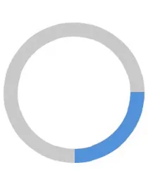
</svg>Or, maybe you want to make it 50%? Here is the half-filled bar:
<svg class="spinner" width="120" height="120" viewBox="0 0 120 120" xmlns="http://www.w3.org/2000/svg">
    <circle cx="60" cy="60" r="50" class="spinner-bar" fill="none" stroke="lightgray" stroke-width="10"></circle>
    <circle cx="60" cy="60" r="50" class="spinner-fill" fill="none" stroke="dodgerblue" stroke-width="5" stroke-dasharray="100" pathLength="100" stroke-linecap="round" stroke-dashoffset="50"></circle>
</svg>
What's this? As Mozilla said about the stroke-dashoffset property:
The stroke-dashoffset attribute is a presentation attribute defining an offset on the rendering of the associated dash array.
I'm already happy how cool it works and how much work I should not do to implement this stuff from scratch. But we're far from the end.
CSS
All's cool, but how to update the progress bar value smoothly? Aren't we going to pass the current value right into the SVG element attribute? That's possible, yes, but not perfect. We have a modern and already reliable way, as CSS variables.
:root {--stroke-dashoffest: 75;}<svg class="spinner" width="120" height="120" viewBox="0 0 120 120" xmlns="http://www.w3.org/2000/svg">
<circle cx="60" cy="60" r="50" class="spinner-bar" fill="none" stroke="lightgray" stroke-width="10"></circle>
<circle cx="60" cy="60" r="50" class="spinner-fill" fill="none" stroke="dodgerblue" stroke-width="5" stroke-dasharray="100" pathLength="100" stroke-linecap="round" stroke-dashoffset="calc(1px + var(--stroke-dashoffset))"></circle>
</svg>Why there is the calc() function with multiplication of 1px? Currently, browsers still have a tiny different behavior about CSS values and can interpret no-unit values differently (f.ex., you can keep it without px for WebKit browsers, but it might go wrong in FireFox). To make it work correctly the value should be presented in pixels while the calculation, but we'll keep it without units while definition.
Now we can control the actual progress value from any parent element by changing the variable.
But! As we can see increasing the value of the --stroke-dashoffset value reduces the progress bar length. As for me, that makes a tiny inverse logic of the process. It's easier to imagine the current progress value from 0% to 100%, rather than as a "percents left until it's done". Let's solve this issue also.
But, please, don't use such a faceless variables as in the example before. CSS variables are very powerful, so you can't know for sure how else it could be used. We'll use clear and monosemantic name --loading-progress which supposed to be in a range from 0 to 100. Maybe someday you'll find another case to use this variable.
Now we'll use a subtraction of the current value of the variable from 100px. But good code is a reliable code. What if there will be something out of [0-100] range in the variable? Let's also add min() and max() functions to limit the possible values.
<svg class="spinner" width="120" height="120" viewBox="0 0 120 120" xmlns="http://www.w3.org/2000/svg" style="--loading-progress: 75">
    <circle cx="60" cy="60" r="50" class="spinner-bar" fill="none" stroke="lightgray" stroke-width="10"></circle>
    <circle cx="60" cy="60" r="50" class="spinner-fill" fill="none" stroke="dodgerblue" stroke-width="5" stroke-dasharray="100" pathLength="100" stroke-linecap="round" stroke-dashoffset="calc(100px - 1px * max(10, min(100, var(--loading-progress, 10))))"></circle>
</svg>
Try to change the CSS variable value with the live example:
Just for example purpose the variable is set inline as SVG style attribute, and the calc() value is inlined too. We'll use separate CSS for the final result.
You might also notice there is a 10 as min and as a default variable value. Why? Just to not show and empty spinner circle in case something went wrong and there is no variable defined. Users should see there is something loading at least. That's possible to create another variable for that.
Rotate
It's time to make the spinner spinning, right? We even have two ways to achieve this.
CSS rotate
To use infinite CSS animation of the spinner. We need to have special @keyframes CSS and apply this animation to element.
@keyframes spinner-rotate {
    to {transform: rotate(360deg)}
}

.spinner-fill {
    animation: spinner-rotate 1s linear infinite;
    transform-origin: center;
}
SVG rotate
To use animateTransform element of the attribute. To make the origin point right that's necessary to wrap the circle by a g tag.
<svg class="spinner" width="120" height="120" viewBox="0 0 120 120" xmlns="http://www.w3.org/2000/svg" style="--loading-progress: 75">
    <circle cx="60" cy="60" r="50" class="spinner-bar" fill="none" stroke="lightgray" stroke-width="10"></circle>
    <g>
        <circle cx="60" cy="60" r="50" class="spinner-fill" fill="none" stroke="dodgerblue" stroke-width="5" stroke-dasharray="100" pathLength="100" stroke-linecap="round" stroke-dashoffset="calc(100px - 1px * max(10, min(100, var(--loading-progress, 10))))"></circle>
        <animateTransform attributeName="transform" type="rotate" from="0 60 60" to="360 60 60" dur="1s" repeatCount="indefinite"></animateTransform>
    </g>
</svg>
Both ways have pros and cons. Choose them according to your case.
You might notice only the progress-bar is rotating. According to your design needs you can rotate the whole SVG.
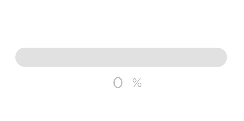
Playground
Finally, we can add the most of the attribute values into CSS to control our spinner view. And again, that's easier to do using new variables. Take a try with the demo lower:
.spinner-bar {
    stroke: var(--spinner-bar-stroke-color, lightgray);
    stroke-width: var(--spinner-bar-stroke-width, 10);
}

.spinner-fill {
    transition: stroke-dashoffset 0.1s ease-in-out;
    stroke-dashoffset: calc(100px - 1px * max(10, min(100, var(--loading-progress, 10))));
    stroke: var(--spinner-bar-stroke-color, dodgerblue);
    stroke-width: var(--spinner-fill-stroke-width, 5);
}
As you can see, that's possible to set the bar width up to 20 and still contain the whole circle into the SVG canvas. That's why we made the circles radius 50 to keep free 10 units space. But you can play with these values according to your needs.
Conclusions
Using a pinch of SVG+CSS we can get rid of a lot of extra code, but have the same good and reliable result. I like the current state of Web-technologies. It allows to create more, faster, and easier year by year. And we could create better things using it. So let's continue ;)
Thanks for reading!